Teaser Trailer
Before deciding on genre, we reviewed our AS film opening and as a group came to the general concensus that creating a horror teaser trailer, with a slight twist, would be the right decision. We knew from last year, as a group we had a strong basis of knowledge as well a high level of creativity and origionality - especially surrounding the horror genre. This meant we wanted to push our creativity and challenge ourselves more then we had done previously.
We decided that we wanted to be completely different and make something innovative that no one else would think of. Therefore, we planned on creating a
werewolf slasher horror trailer. We understood this genre would be a challenge as it is so deeply influenced by CGI, however we felt that as a group we could complete the task.
 |
| Fig. 1 |
Although we wanted to create something new, we understood that we needed to conform to certain codes and conventions, whilst challenging others at the same time to provide the twist we desired. For instance, we used a lot of footage of a full moon (Fig. 1) to show our audience that at this point the werewolf is likely to be at its strongest. However, we did not want to be limited to only being able to film when the moon is out, as this could be impossibly to light effectively. To combat this, we decided to use a 'Lycan', meaning that the subject can choose when he or she transforms, giving us a new twist. At the start of our planning we toyed with the idea of using a 'shewolf' plot, however after consulting with a number of people from our target audience we realised that this was too much of a twist to keep our taregt audience intrested. We knew that challenging codes and conventions this much could work against us.
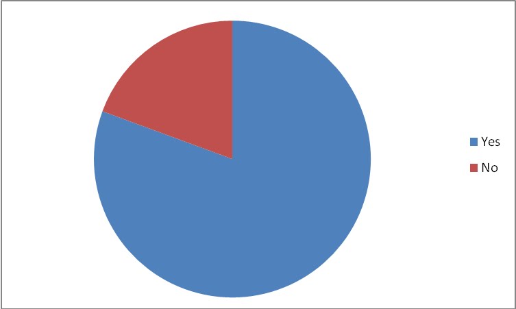
We created a poll to see where we should set the majority of our trailer. General feedback was that our audience wanted to see a traditional woods location but also an urban area, giving it a new, present day horror feeling and a sense of 'reality'. (
for questionnaire results, click here)
Through implemmenting a variety of locations into our trailer, we therefore challenged a number of conventions of general werewolf films. However, we wanted to develop these typical locations found in werewolf films so after researching into other areas, we made the long trip to
Dungeness; a remote coastal location, with a few sparse buildings, often abandoned and with nothing in its immediate surroundings. (See Fig2 ) With correct framing and timing, using our shots from Dungeness as establishing shots to open our trailer, sets up the theme of isolation to our audience, whilst also developing on the idea that the werewolf is an isolated figure himself.
Both the traditional woods location, and the new Dungeness location cry out isolation. We just wanted to be different from all our predecessors and go places not many have gone before!
 |
| Fig. 2 |
Typography
We did not want to stray too far from the generic conventions found in titles of films from the werewolf genre as the title and presentation will be the first thing our audience will see (especially on the poster and website). Therefore we researched typical conventions of werewolf titles and used a font base from dafont.com, called 'Vanhelsing'. We then enhanced the 'Vanhelsing' font using Serif Draw software to make it unique. (
For more typography click here)

It was also important that we looked into the
main conventions of other werewolf teaser trailers. Almost all of them followed conventions of partially revealing elements of the werewolfs physique, regardless of the film budget. We felt the downfall of 'The beast of bray road' trailer was that it showed too much of the beast too quickly, as this lost suspence.
As our trailer was very low budget we
chose to show the human anatomy during transformation from man to wolf. This low buget meant we had to be creatve when we did show the werewolf. We did this by blacking out the eyes of the actor under the werewolf mask and filmed only the eyes and hair around the eyes. We then edited this footage, by ehancing darkness and increasing the contrast using the iMac to make it even more realistic.
Theories:
It was extrememly important that we looked at some film/narrative/genre theories as it is vital to follow some of them.
Binary Opposition
Without any victims, there would be no one for the werewolf to hunt, therefore, there would be no werewolf film. Without a full moon, there would be no werewolf etc etc. The audience were able to create a sense of good and evil and therefore associate the text with the genre. We used colour to help us create this clear opposition, by dressing the victims in white denotes purity and innocence, whereas the werewolf was edited to be in a darker area with aunappealing green tint, denoting a darkness in spirit and therefore evil. Both creating the association between ‘light and dark’ and ‘good and evil’ and therefore reinforcing the binary opposition of the text We needed to make sure we used the right characters so to create a strong and viable plot, and this leads us nicely into the next theory...
Vladamir Propp's narrative theory
Although we needed to have the sufficient characters, as we were creating a teaser trailer, these characters do not have to be introduced as such. As we only had a minute to attract the audiences attention and make them want to watch the full feature film, we showcased the best bits of action in our trailer and this follows general codes and conventions of teaser trailers which are known for having fast paced editing combined with a build up of sound. This would be slightly different however if we had the access to famous and well known actors and actresses, as in that case, we could use the high standard of acting to create a pull for the audience. Therefore, we challenged Propp's theory.
As mentioned above, we experimented with lot's of different types of sound, and in the end combined and overlapped many different tracks to create a build up of tension to accompony our ending. This non-diegetic music also linked in with the diegetic panting that could be heard at times during our trailer too.
Syd Field's three act plot structure
This theory does not really apply to the context of a teaser trailer. We challenged this theory, but at the same time stuck to codes and conventions of a teaser trailer. For example, ending on slight disequilibrium/cliffhanger so to entice the audience into wanting to watch more.
Although it is an old concept, present day film makers are looking for more and more different ways to convey the action in front of them to the audience and we decided to use a lot of handheld camera action after we were inspired by such films like Quarantine. Again, this gives a more realistic feeling and a whole host of low budget handheld films have become a big success (e.g. The Blair Witch Project). We also used a lot of point of view shots of both the werewolf and it's victims as we thought this would make the audience feel closer to the action
Our narrative - We also wanted to challenge conventions of teaser trailer narrative and create something completely different, and to do this, we mixed genres a little bit. Through implementing the use of stages 1, 2 & 3, this enabled us to structure our trailer better whilst also acting as a great tool for giving the audience a reason to want to see the whole film. Ending with the suspense of now showing any stage 3 footage worked brilliantly for us.
We followed generic conventions of using a tag line for our trailer. 'Control is no longer an option' is both catchy and pulling and suggests something terrible could be about to happen. It also links in with our use of stages as well.
Aristotle’s Unities – Narrative is created within a ‘unity’ of time, place and action, it should take place in the same location –
Aristotle’s unities theory derived from his watching of plays during the ancient greek times, therefore this theory – appropriate to much theatre doesn’t coincide with the values of modern texts In our project we didn’t conform to the theory behind Aristotle’s ‘unities’ in order to show movement within our trailer we used multiple locations within our text, this conformed with many of the texts we used for references during our ‘research’ stage such as ‘brother hood of the wolves’ . We also broke these conventions due to the results of our questionnaire; this informed us that people wanted to see a werewolf film which took place in a more urban, relatable area, therefore part of our text was filmed in an urban location. Using multiple locations in our text (and therefore defying Aristotle’s ‘unities’ meant we were able to create more enigma. In modern werewolf texts the locations changes across the movie, as we only had a teaser trailer – and therefore had to show multiple locations within it in order to appear to be conforming to the expectations held by the audience of the genre.
Freytag’s Dramatic Structure – narrative ‘arc’ created from; exposition – rising action – climax – falling action & denouement - catastrophe – resolution
The narrative arc does not seem to cover all genres of film under its structure, in horror and thriller films there is not always ‘resolution’ and the ‘catastrophe’ may be more apparent earlier on in the text. – During the research and planning stage of our project we looked at multiple texts from our chosen werewolf genre, we found that the dramatic structure hypothesised by Freytag did not fit the genre, there often wasn’t a sense of complete resolution, and the text’s rising action often stemmed from catastrophe. The nature of the horror genre is a lot less predictable then marked out the Freytag’s work, and the erratic nature of the genre doesn’t fit the ‘arc’ mould. Therefore in our teaser trailer we did not follow the ‘arc’ for multiple reasons, firstly to create a sense of ‘resolution’ within a teaser trailer would be unwise as it would create a lesser sense of enigma surrounding the text, also our text was a mixture of unpredictable movements between rising action and catastrophe in order to create excitement and to follow the conventions of the genre
Barthe’s Enigma Code – narrative establishes enigma/mystery and therefore creates tension – potentially one of the most prominat theorys when attaching narrative ideas to a teaser trailer, the enigma code is parallel to the assumptions of our given texts–
During our media text the enigma code highly influenced our work, due to both the nature of the project and the codes and conventions of our genre, we found it of high importance to create mystery, and to have questions unanswered in order to appeal to the audience and to make them want to watch the text. We did this by not giving an obvious narrative structure, but instead filling the text with scenes from various parts of the ‘film’ by doing this we were showing narrative but without structure, creating appeal through the audiences need to find the answers
Todorov - equilibrium – agents of disruption – disequilibrium – renewed stage of peace and harmony - again although inspiration can be taking from this theory it cannot be strictly followed, due to the fact that this theory refers to an entire narrative. –
We were unable to follow Todorov’s theory but once again took inspiration from it and adapted it to suit our media text, we aimed through establishing shots to create a sense of ‘equilibrium’, and the scenes of murder and appearance of the werewolf therefore acted as the ‘agents of disruption’ within our text, we decided to leave our trailer in ‘disequilibrium’ as this worked better for a teaser trailer, in order to create appeal in watching the entire text.
Allan Cameron – 4 types of modular narratives: Anachornic – (use of flashbacks/forwards with no clear dominance between narrative threads), Forking-path, Episodic & Split screen narratives – this is a theory of which we partly followed, due to the spereation of characteristics it is difficult to meet the criteria of all the described narratives –
Our media text followed the narrative structure outlined by Cameron as being ‘anachronic’ due to the nature of the project it was important for use to include as many aspects of the ‘overall narrative’ from the ‘film’ as possible, therefore we used a lot of flashes both forward and back (although unspecific due to the restricted narrative) to show the passing of time. As it was a teaser trailer, in order to ‘tease’ the audience it was important for us to include ‘no clear dominance between narrative threads’, which we did successfully, therefore conforming to the theory outlined by Cameron
Poster
We
analysed a host of film posters across a wide range of genres, although obviously focusing on horror. It was vital that we understood how to produce and layout our poster, as presentation is everything. The use of branding also enabled us to link our trailer to our anciliary tasks (e.g. through typography and use of the Lycan symbol engraved into the subjects back).
We looked at a number of posters which can be found in
Poster Analysis, and we considered every element which goes into creating a poster. The use of dark colours are codes and conventions of horror posters (usually red, black and white) and a good use of
colours can set the feeling for the film.
The exorcist poster uses only black and white to convey meaning, which works really well, however, as our film is more of a slasher, rather than a psychological horror, we thought it was key that we used a few more vibrant colours. Also, as we wanted to create something innovative, with a brand new urban feeling, we thought it was important to use a few more urban colours such as a tinted darker colour which could represent the colour of the moon.
We then came across two other posters which inspired us:
30 days of night, and Frankenstein.

The colours in 30 days of night really attract the viewer and almost spurt out at you, whereas the impact in the Frankenstein poster is a lot more subtle, but also contains a lot of
connatative meanings. We decided we wanted to create a blend of the two posters: Something that stands out at the audience, but also one with subtle meaning behind it. Cue Lycan.
We also needed to take notice of certain ideas and theories such as the Golden circle or section, as we wanted our audience's eyes to be drawn to the most important parts of the poster, such as the film name, as this is ideally what we want the viewer to remember.
We conformed to the conventions of text in film posters. Such as placing the credits at the bottom and out of the way, and also making the tag line and release date easily viewable. The information is placed in order of importance,with the title at the top, subject in the middle, tag line and release date at the bottom, and credits out of the way. We therefore conformed to these expectations of film posters. Some things should just not be tampered with.
To symbolise our beast or Lycan, we needed to scout a strong male with a lot of muscles to show, as the public are enticed to look at naked bodies for some reason, they just cannot help themselves. We scouted two boys and took pictures of their backs after being inspired by a couple of other posters, and this formed the basis of our image laid out in the poster. Using conventionally good looking, provocative or muscular characters conforms to general conventions and this makes the impact of our film even bigger, especially as we suggested throughout the creation of Lycan that children may be involved in some way. As we continue to mention, we wanted to be completely different and create something new and current.
We chose to use codes of conventions of film posters to create our own, and didn't really want to try to develop too many ideas. However, our poster includes a number of overlayed images which, like the Frankenstein poster, contain hidden meanings. These hidden meanings were designed to show that the Lycan is alive and could be mid-transformation, making the poster all the more scary. This could also be seen as developing on the codes and conventions of film posters as images are usually set out not to move or tell a story, however, ours does.
Website
As we had never created a film website before, we needed to conduct research into how they are and set out, similarly to how we went about creating our poster. However, members of our group had already set up blogs for their own interests so we utilised these skills.
We started by holding a focus group in which we discussed what the key elements of a general website and a film website were. Many people liked websites with straightforward links and a clear layout and hated websites with pop-ups and too many clashing colours. We also found that one of the biggest website bugbears was when the user has to scroll horizontally or vertically to access more of the page. This became something we had to battle with throughout our creation process. After researching through website making tools and websites, and researching what last years Media groups used, we decided that Wix would give us the most amount of creativity, whilst also keeping things fairly simple for us.
We anlaysed many other film websites such as the Saw Franchise and noted down a number of codes and conventions we had to follow, and ones we wanted to develop and tweek a little.
Similarly to the poster, and from a
branding point of view, we kept the title at the top of the page as this is what we want the audience to be drawn to. We also moved the tag line up however as we discovered this is what a lot of other successful film websites did.
We also had to
conform to the fact that present day website allow for a lot of different features and links to other sites such as social networking sites. We made sure to link to all other media platforms for 'Lycan' such as
Facebook and
Twitter pages. This acts as another platform for fans to find, follow, like and just generally find out about the film. Film websites and being online is now more important than ever and could be seen as the key to promoting a new film well, and we recognised this and made sure to conform to these new ideas and conventions.
To view the up and running website
click here


