It is important to look properly into typography among different media products.
Typography can be defined as:
1a. The art and technique of printing with movable type.
b. The composition of printed material from movable type.
2. The arrangement and appearance of printed matter
We need to focus mostly on effective uses of typography within the following:
1. Posters
2. Websites
3. Film magazines
Posters
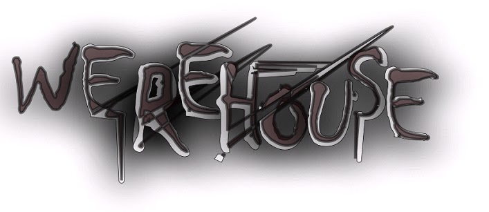
• Film name is placed in the centre of the poster, therefore not complying with the golden section zone. However, the crack that runs from the ‘T’ draws your eyes around the page and most notably to the font at the bottom which is telling the reader that the film is a production of the classic- John Carpenters ‘The Thing’. The font is a good size- big enough to read comfortably, but small enough to attract the reader’s attention properly.
• Is it legible? - When you actually focus on the font, it is quite hard to read which may be due to the letters being the same colour as the white floor or background. Yet, at a quick casual glance, the writing is very clear.
• The posters style indicates that the font is arising from the unknown/underground which could play on the audiences’ fears. The way that the crack has been shaped to form a word could also possibly suggest that ‘the thing’ is capable of anything.
• Colour scheme- Mainly
black and white. Past the font, we see what looks like mountains, however the deep blackness again plays on fears of the audience of the
dark and the unknown.
• ‘Man is the warmest place to hide’ – Confusing and not the best tagline in the world, but the line gives the reader a small insight into the plot of the film, possibly indicating that ‘the thing’ hides among mankind.
Websites

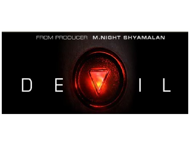
Film name is positioned at the top centre section of the website, above the theatrical trailer which plays instantly when the page has loaded. Typical white font on black background is used to stand out, and the red ‘V’ is used very effectively. The v is replaced with the down button you press to take an elevator, of which the film is centred around. The down button has a red filling which connotes the work of the devil, and the audience could also see the button as pointing down to the depths of hell or the underworld. Finally, having the evil lift button in the centre of the word shows that it is in amongst the letters themselves and we know from watching the trailer that there are five main characters in the lift- how many letters in devil? – 5. Coincidence- i think not.
Film Magazines
Many film magazines change their cover style each week to match the film they are featuring. In this Empire magazine, the name of the issue has been completely changed stylistically to match the new hellboy film genre. The use of flames flaring off of the name is used to good effect to
grab the readers’ eye.
Again, black background is used to make the white and red stand out more. The film name is positioned at the bottom of the cover, but it still stands out in block capitals. Interestingly, the main character of the film is placed in front of the Empire name, showing how important he is, but this is not a problem because pretty much everybody knows the Empire magazine franchise and it does not matter if a couple of letters are blocked out. More importantly, the name of the film is positioned over Hellboy, causing no confusion to the reader.