
These were two of the inital designs we came up with:
 |
| Fig. 1 |
Fig. 1
We wanted to create the effect of blood dripping from our film name. Although we werew able to create this dripping affect, the font is too cartoon like and the blood red is too bright and looks comical, which is not the impression we want to give. However, for a first attempt it was invaluable to learn the techniques and to get a greater understanding of what will make this sucessful.
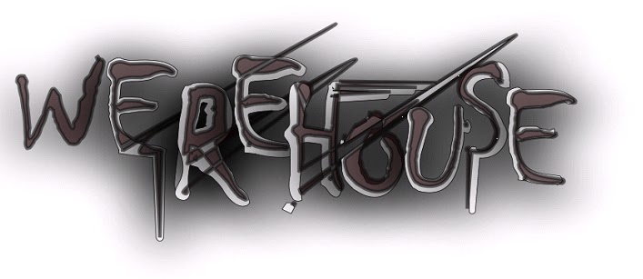 |
| Fig. 2 |
Fig. 2
Here, we tried to use more appropriate colours. We chose a darker, faded red, almost brown, and black to create an almost gothic feel, as we gained a lot of inspirateion from wrewolf films during the gothic era. We again tried the dripping blood idea, however, it was less sucessful this time although the font was clearer.
Now we know the basic techniques surrounding font manipulation we can continue to develop these techniques and ideas.
No comments:
Post a Comment